Best New Sports Logos From 2016
This year has been amazing for the debut of some awesome sports logos. We began this company for a few reasons. The first is we love wearing super soft t-shirts, not shirts that could double as cardboard. The second and most important reason is that sports logos went through what we like to think of as a “vanilla” stage. A stage where many parent clubs were forcing a form of their logo across the minors to further create brand awareness. Logos were no longer localized highlighting the great history of that area. Our goal at Awesome Sports Logos was to bring back the fun and creativity to sports logos with our t-shirts. We wanted to be the opposite of the political correctness that was occurring.
Times have changed though and that’s because of you, the sports fan. You responded with the wallet scooping up merchandise from teams like the El Paso Chihuahuas which caused others to take notice.
So here are a few of the sports logos that we were happy to see debut in 2016.
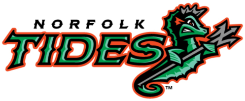
The Norfolk Tides
Logos courtesy of SportsLogos.net
This was an awesome upgrade of a logo that needed an update. You don’t see any Seahorse sports logos so it’s one of a kind. Cool colors with a nice touch of Oriole orange to represent the parent club. You might miss this small nuance but check out the Trident the Seahorse is holding. A usual Trident has three prongs. This one is an “N” for Norfolk. Nice touch for an awesome logo.
The Savannah Bananas

This is an amazing story of how a sports logo fueled a franchise. When the logo made its debut, viral marketing took off. Pardon the pun but people were going “bananas” for their merchandise. With that came people supporting this local collegiate league franchise. Sell out crowds and a championship season followed. The Bananas are alive and well in Savannah!
The Hartford Yard Goats
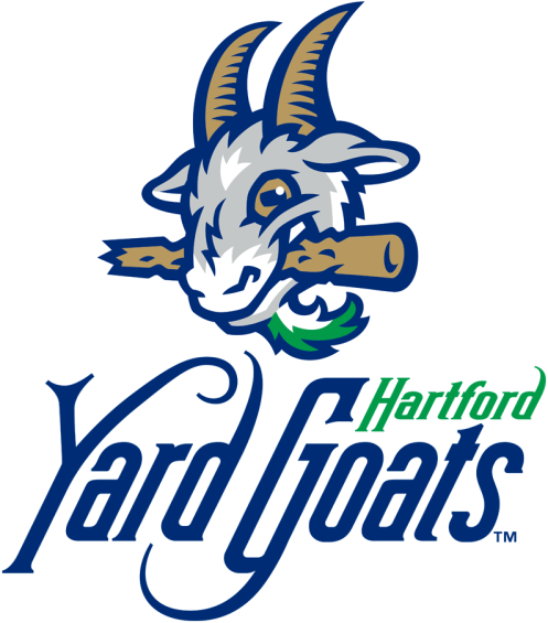
Hard to believe that such an awesome sports logo had to play its complete first season on the road because their stadium wasn’t finished on time. A Yard Goat is actually from railroad yard slang. A great touch of this logo created by Brandiose is the colors. Green, Blue and White were the colors of the former NHL franchise in Hartford, the Whalers.
The New Orleans Baby Cakes
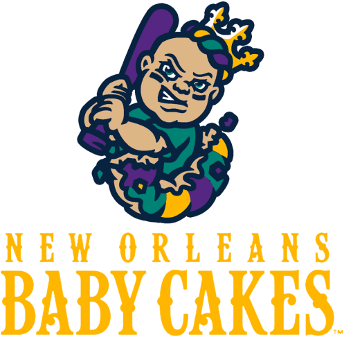
This logo only debuted a little over a month ago and I love it. While merchandise sales have picked up, there are many in New Orleans that loved the old name Zephyrs but in the teams defense, that name was carried over from when they played in Denver. What is a Baby Cake? A Baby Cake is a figurine found in King Cake during the Carnival Celebration season in New Orleans. A baby swinging a bat is all I need to love it.
Jacksonville Jumbo Shrimp

The Jacksonville Suns needed a logo makeover and they certainly got one with the Jumbo Shrimp. You might not notice at first glance but the shrimp curls up to form a “J”. St. Johns Navy, Patriotic Blue, American Red and Shrimp make up the team’s new official colors, paying tribute to Jacksonville’s rich military heritage. Huge improvement in Jacksonville so we say, “Go Jumbo Shrimp!”
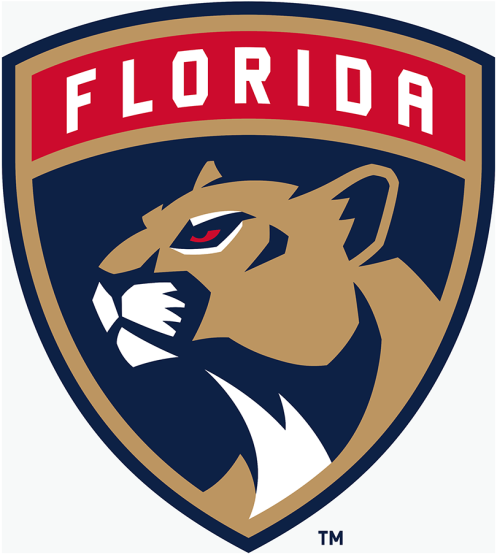
Those are a few of our favorite minor league logo changes. On the pro side, kudos to the Florida Panthers and their new NHL design.
2016 was an awesome year for Awesome Sports Logos and that is thanks to you. Here are our top 3 selling t-shirts.
The Cocksville Blockers

The Las Vegas Hookers Fishing Club

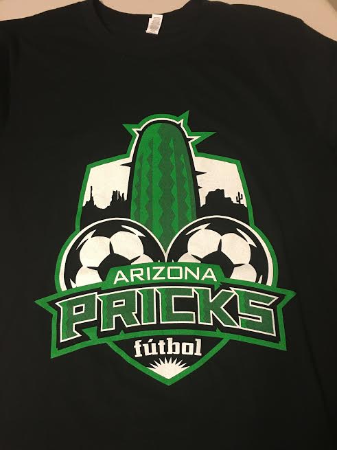
The Arizona Pricks
Grab these 3 as part of our T-shirt of the Month Club. No better way to begin 2017 with a super soft closet favorite in your mailbox.
Happy New Year everyone!
Gavin Spittle
Founder, Logo Lover, T-Shirt Fanatic
Awesome Sports Logos
